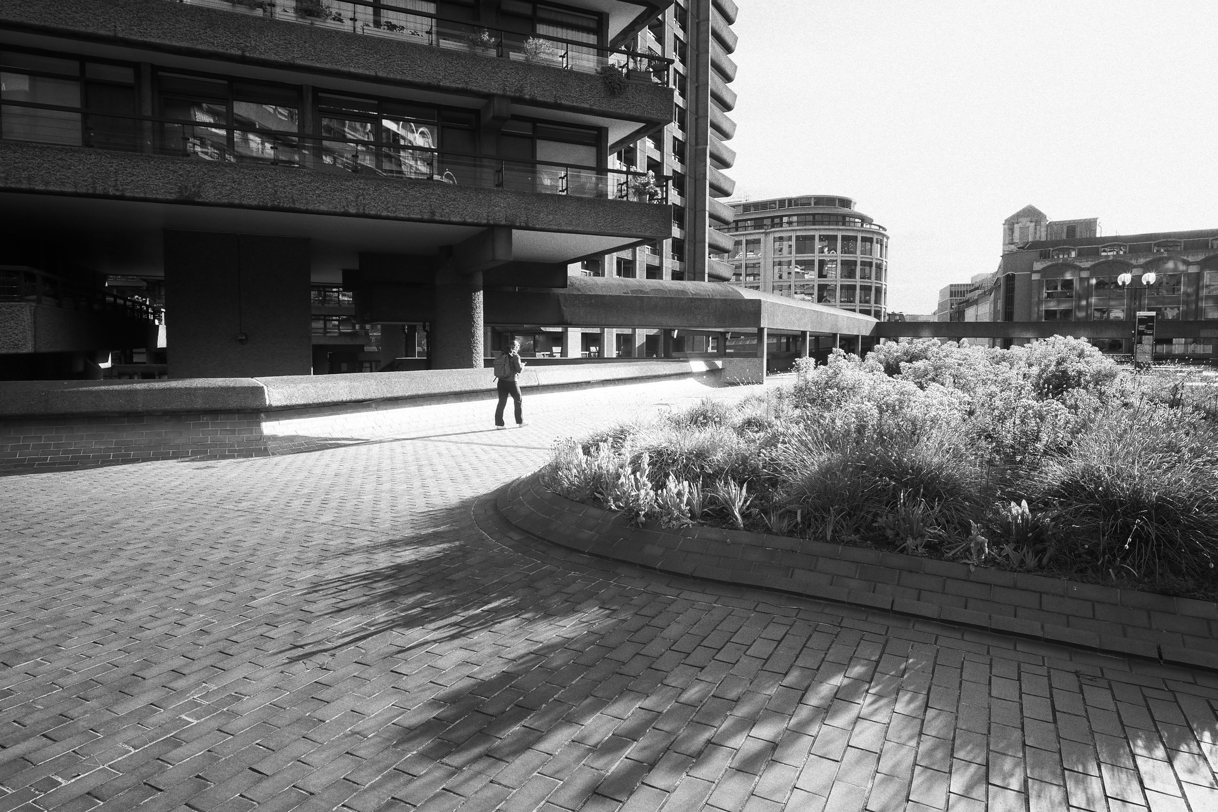
Barbican Centre 2024
I am utterly absorbed by brutalist modern architecture. I say ‘modern’ but I probably mean from the 1960s to the 1980s or thereabouts. I love the energy and force in these powerful shapes, the texture of the concrete and in particular the way it reacts to the changing light.
I took these shots over the space of an hour or so with photographer and YouTuber Jimmy Cheng, who introduced me to this spectacular modern marvel.
Not all of these shots are of the Barbican Estate. I took a few more before and after, as I’m a fan of architecture of all periods.
I like to include people in my shots. They are usually quite small, but captured very carefully in the right space, the right light, ideally mid-stride. I think people add a strangeness and a mystery to architectural and street shots that makes them all the more absorbing.
Anyway, here’s a selection of photographs. They were taken with an OM System PEN E-P7 with a Laowa 10mm f/2 lens using a custom black and white camera profile with a grain effect – followed by some slight enhancement and editing later on in Lightroom.
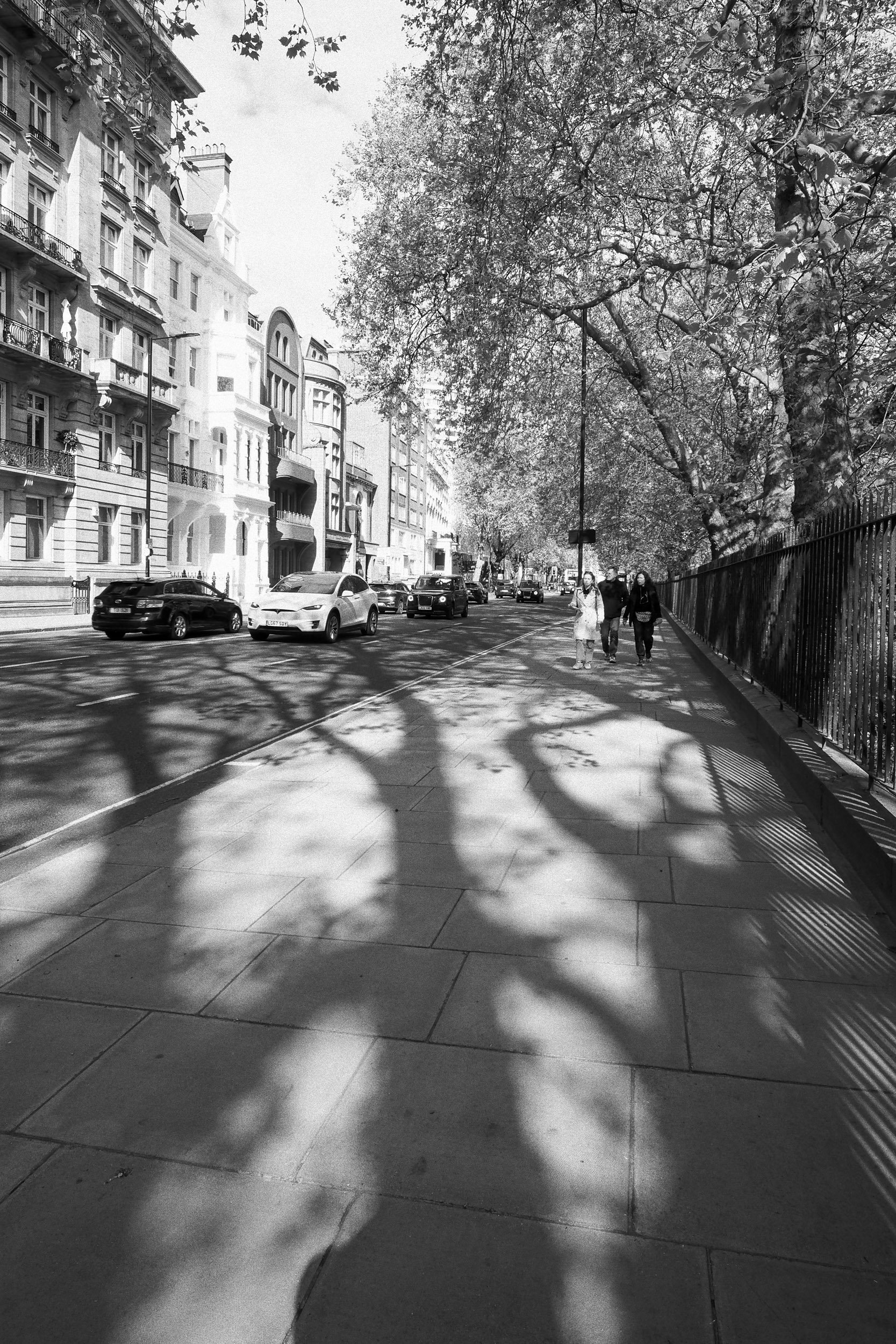
My visit was in late spring when some of the trees were still bare. A wide-angle lens exaggerates the perspective and makes the shadows of the trees look a little like grasping fingers. It's good to keep the shadows dark. You don't need to see any detail, and it makes the contrast and the shapes stronger.

You get all sorts of architectural styles – and colours – in the buildings facing this section of Hyde Park. I was stopped in my tracks by the beautiful white facade of the building in the centre, the brilliant spring light and the feathery fresh foliage from the trees above.

Bare tree branches can make fascinating shapes. What I liked here was partly the tonal contrast between the nearly silhouetted tree in the foreground, but also the way the branch curled around the shape of the building behind.
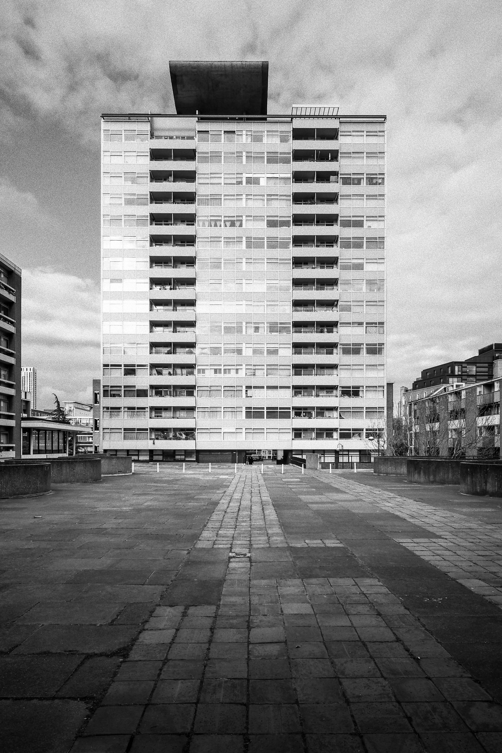
I don't much like the rule of thirds. I find much more impact and interest in symmetry. For this shot I also corrected some slight convergence in the verticals so that the building was completely straight, and added a little light to the foreground.
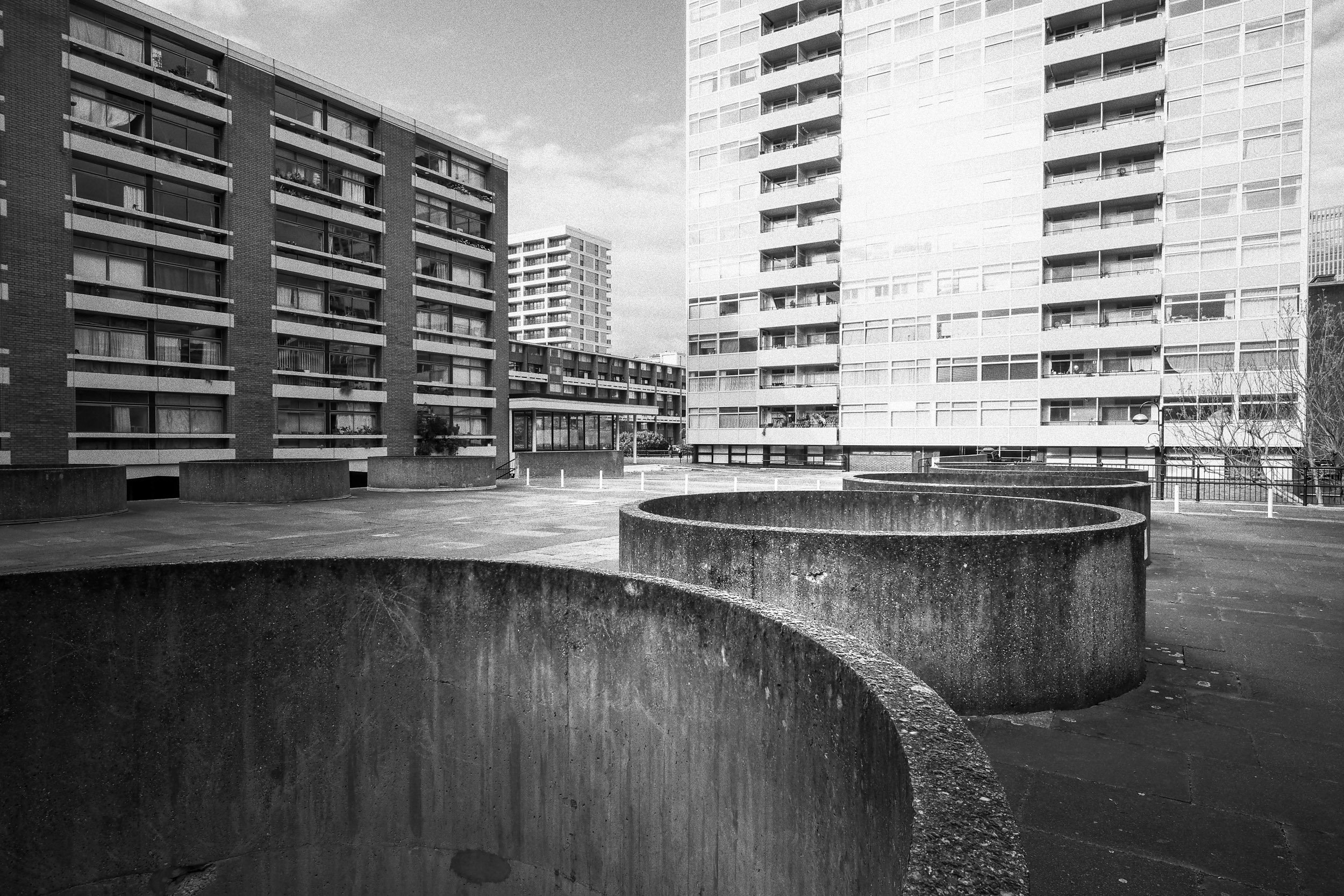
I don't know what these circular concrete openings are for (I should Google it) but their shapes are strange and striking. I chose a viewpoint where I could get them in the foreground and 'layer' buildings at different distances in the background. I like the way that two are 'looking' in one direction and another looking the other way.
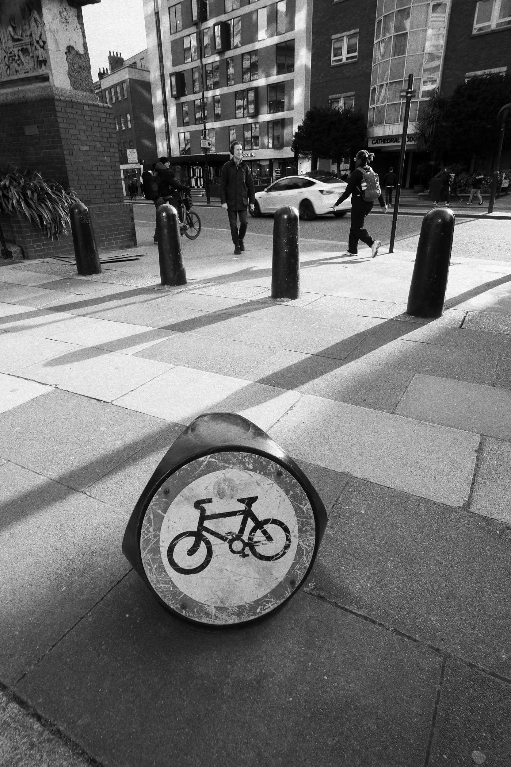
This doesn't really have any specific meaning, except that it seems to sum up for me the oddness and mystery of the best street shots. A sign with no obvious meaning, two people going about lives that we know nothing about, and a nice combination of shapes, angles and sunlight.
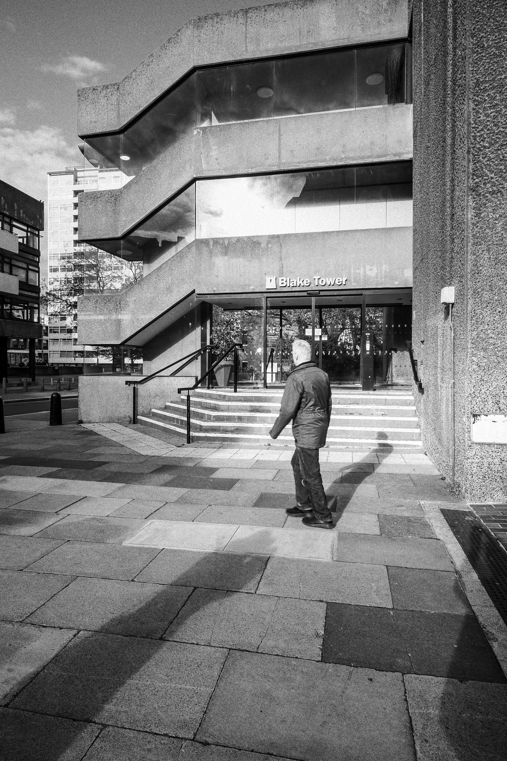
I might have thought at the time that I was making some statement about humanity's place in a brutal concrete landscape, but really this was just a celebration of light and shapes. Handily, Jimmy's shadow (he was right beside me) points exactly to the man in the foreground and his own shadow.
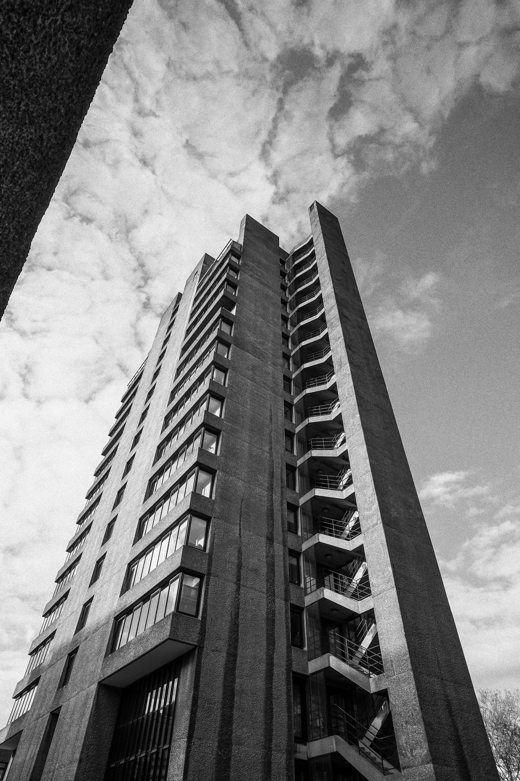
Framing is a very useful compositional technique, but the frame doesn't have to completely enclose your subject. The edge of the roof at the top left of this shot adds some foreground interest and scale, but it's also perfectly parallel with the edge of the tower block which, for some reason, strikes me as being important.

The same tower, but this time with a shifted viewpoint that shows a more distant tower behind it. I'm not sure I like this one as much.
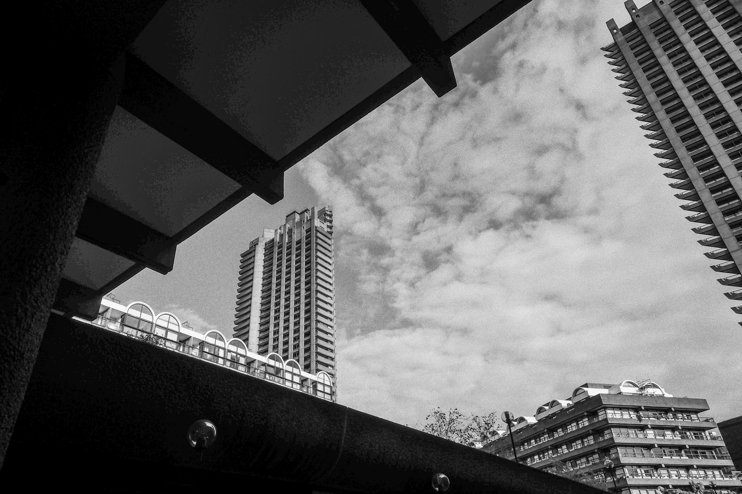
I do like structured complexity, though I think I might just have invented that term. There are lines, angles and textures everywhere in this shot, all enclosing the distant tower block.

The light was bouncing very nicely off the windows in this building and reflecting off the foreground – then this mother and child came along to finish the shot perfectly.
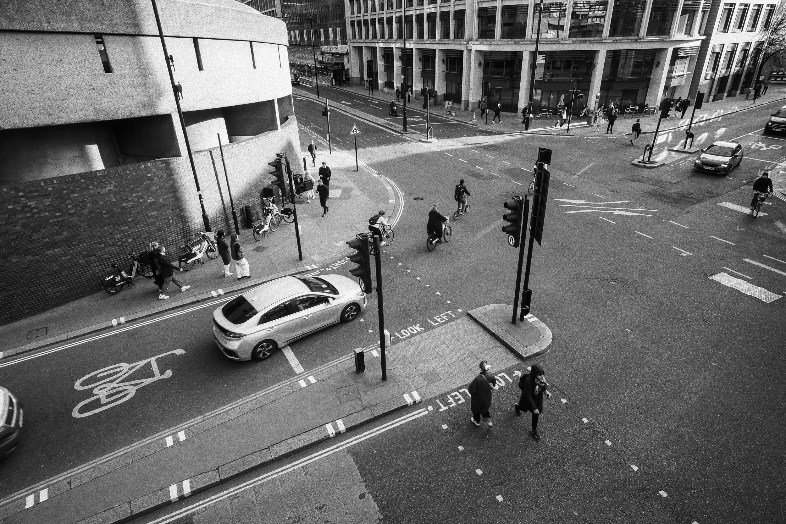
If you can find an elevated viewpoint over a traffic interchange, you can get some great shots. I like this composition because there are so many different directions of movement, both visible and implied, but somehow locking together in a rather satisfying way.

This might be my best shot of the day, though I haven't quite decided. It's got pretty much everything – framing, perfect verticals, tonal contrast and the kind of interlocking shapes and lines that always catch my eye.

I like the light and the textures in this shot, though I had to help it along a bit with a radial gradient in Lightroom to lighten and strengthen the foreground. Otherwise, it all works really well, with all my favourite elements – a rigid structure of interlocking lines and shapes.
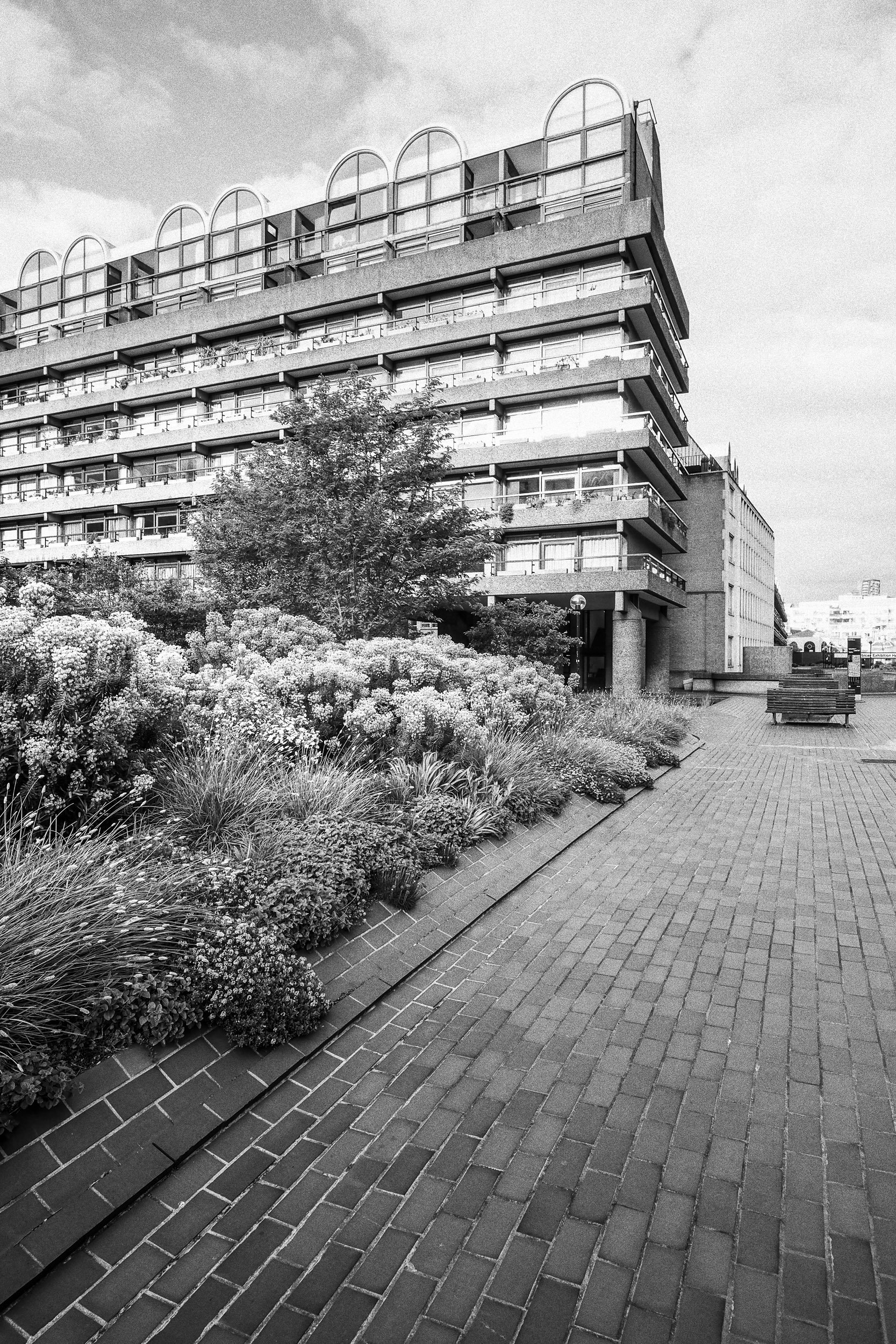
I'm less pleased with this one. I think it needed a little more contrast in the lighting. I could fake it in Lightroom with a vignette, perhaps, but I don't think it would look quite as good as if I'd just waited a little for the light.
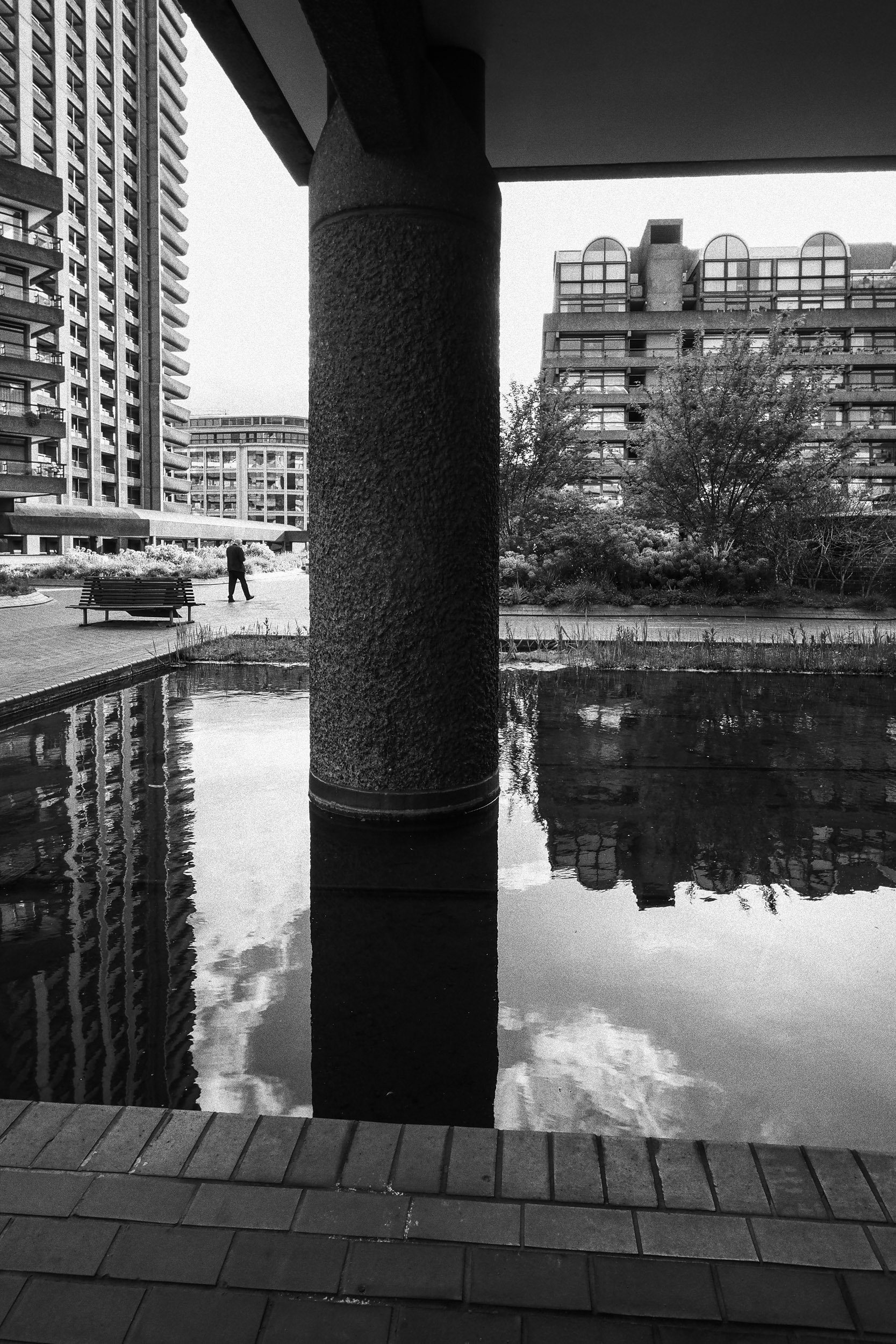
I do like this one. Perhaps you'll see what I mean about my liking for human figures. The man in the distance is very small but a key part of the picture. I waited until he was right in the middle of that gap and mid-stride. Lucky!

I'm usually in two minds about converging verticals where architecture is concerned, but the tower was too tall to capture with the camera held level – but with a bit of careful positioning I was able to use the dark mass of the building next to me to produce a nicely balanced composition where the vertical convergence became part of the effect.

Photographers don't like being subjects, but Jimmy was patient enough to wait for me to get into position and then walk into the frame on cue. It would have been nice to get better separation between him and the background, but maybe I'll come back to this to try a little crafty editing.
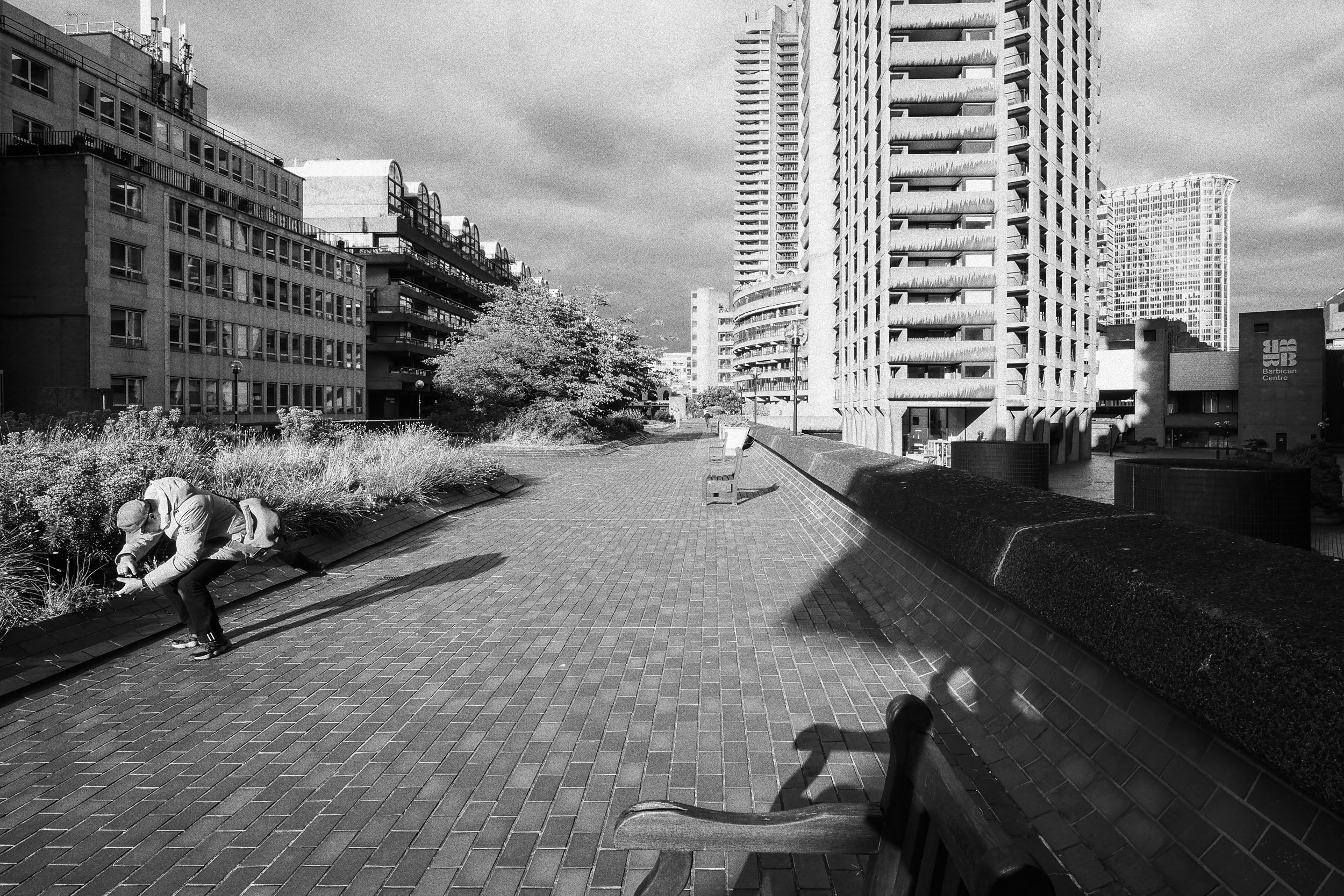
Jimmy again. I haven't told him I took this one. What appeals to me here is partly the shapes and lines in the composition, but also that sense of mystery and enigma you can introduce with human figures. Not a very flattering pose, I'll admit, but one that adds another layer to the picture.

Here we are again, waiting for a human figure to be in the perfect position. I do this a lot with street photography – I find the perfect position, lighting and framing and then wait for someone to walk into it. It's a lot less threatening than chasing after people and pushing a camera in their face.

This was just odd. I was photographing the elderly gent on the bench looking away into the distance when this couple walked into the frame. She started photographing the buildings, the man started photographing her... and I was photographing the pair of them. Oddness and irony together. Perfect.

I kind of think this is a rather obvious kind of street photography, but if you can work out the composition beforehand, as I do, then all you have to worry about is the timing. I had to help this along in Lightroom with a radial gradient mask to lighten the foreground and the area under the roof.

I think I like it, but it's not my favourite. I've done all the classic compositional things, with straight verticals and a nice curve in the road leading into the centre of the frame. I also like the different directions of the pedestrians and cyclist. But... I don't know.

What could be more iconic than London telephone boxes – though I'm not sure why there are four together and in two different sizes. All it needed to finish this shot was a commuter walking across the frame right in the gap between them.
